
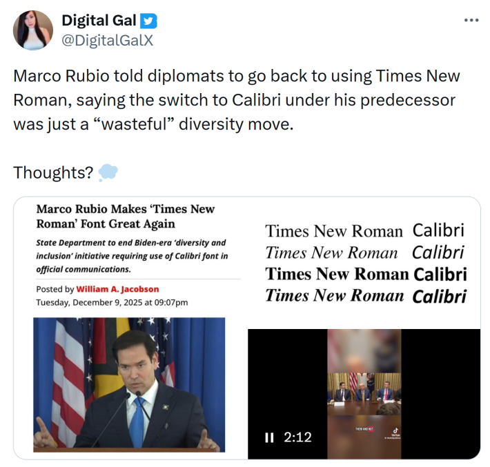
Secretary of State Marco Rubio created what appears to be a war on fonts this week with an order that told diplomats to ditch Calibri and switch to Times New Roman.
The move reversed a 2023 decision under former Secretary Antony Blinken, which connected Calibri to accessibility and diversity goals, and opinions online were mixed.
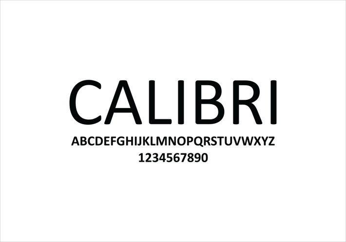
Return to serif typeface
Rubio described his directive as a way to restore professionalism and tradition. In his memo, titled "Return to Tradition: Times New Roman 14-Point Font Required for All Department Paper," he said Calibri clashed with official letterhead and looked informal.

While framed as a matter of presentation, the memo also pointed to "radical" diversity, equity, inclusion, and accessibility programs.
Times New Roman had served as the standard for nearly two decades before the switch. Rubio argued accessibility did not improve under Calibri and called the shift ineffective.
Blinken’s change aimed to help readers with low vision, dyslexia, and those using screen readers. Sans serif fonts are generally considered easier to read, but as Accessibility.com noted, "this isn’t universally true," depending on the design of the fonts.
Accessibility advocates appreciated Calibri for its spacing and simpler shapes, making them easier to parse. Still, Rubio cited serif fonts as more formal and linked them to government usage and Roman design.
Reactions to Rubio's order
Folks on X shared their opinions about the shift to Times New Roman. Some users supported the serif return. @chhendon said, "One of the few things I agree with Rubio on? Just about every font, but Times in particular, is better than Calibri."
Likewise, @bradybd tweeted, "This may be the only thing I agree with Marco Rubio on [...] Although a 14-point typeface is way too big."

@Sassovivente joked, "Glad @marcorubio is focusing on our real enemy — Times New Roman. 🫡"
Others stressed accessibility concerns. @Fly_Sistah said, "Marco Rubio halted the official use of Calibri to stamp out diversity efforts. Antony Blinken ordered the typeface change to Calibri to improve accessibility for readers with disabilities, such as low vision & dyslexia, & people who use screen readers."
Humor also surfaced. @LRinaldiArt joked, "Marco Rubio wakes up every day thinking about the Times New Roman Empire and brutally defeating woke Calibrius." Meanwhile, @SourdeathSam added, "Probably heard it was sans serif and thought that was an antifa leader."

Even reluctant agreement appeared. @aembot47 said, "It brings me no joy to agree with Marco Rubio, but Times New Roman is superior even if his reason for the switch back is dumb." Additionally, @Phil_Lewis_ noted, "Marco Rubio ordered diplomats to return to using Times New Roman font in official communications, calling his predecessor's decision to adopt Calibri a 'wasteful' diversity move."
Finally, @haug4_haug commented, "Yes, accommodating people with vision problems is way too woke."

The internet is chaotic—but we’ll break it down for you in one daily email. Sign up for the Daily Dot’s newsletter here.